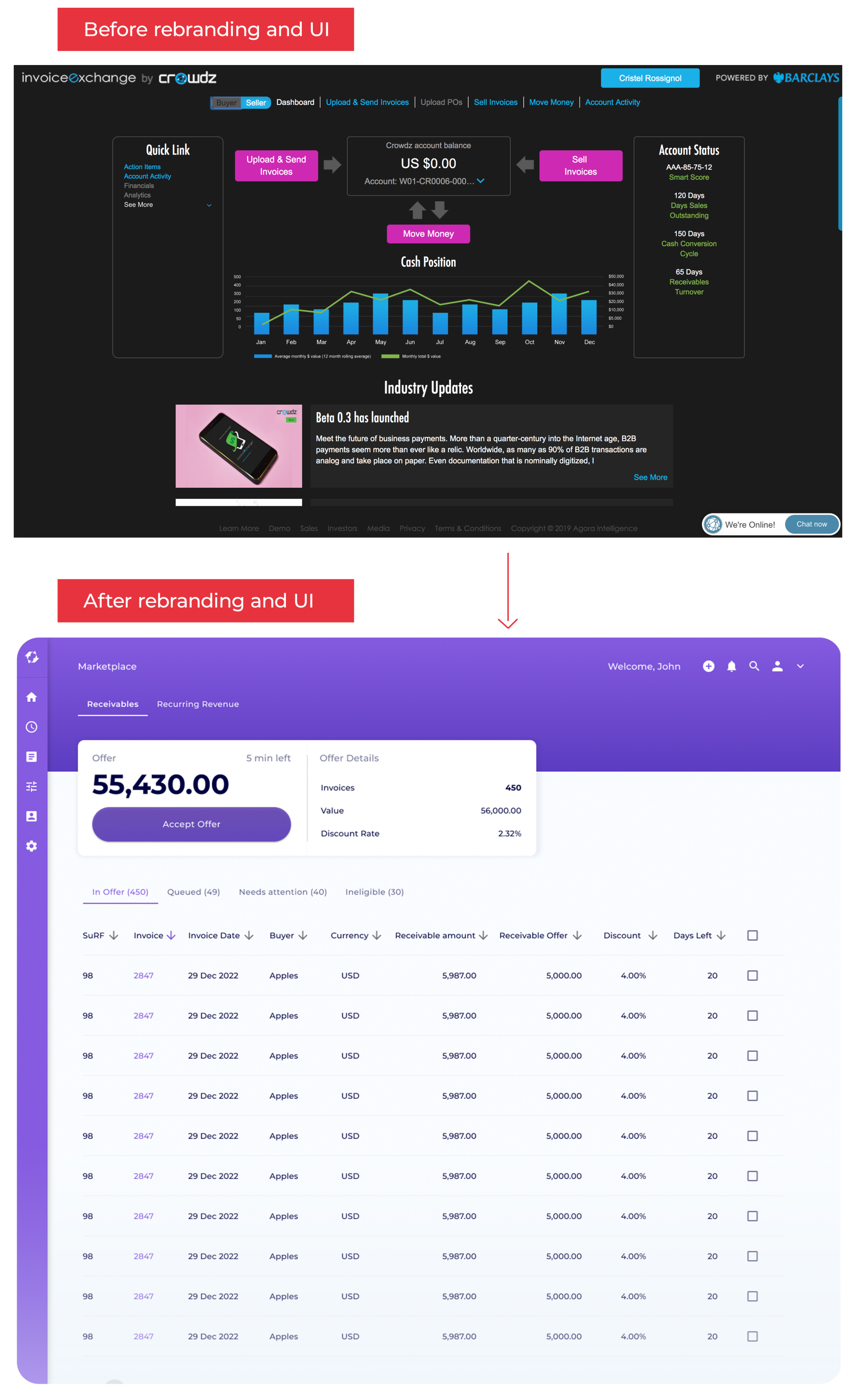
Here's a glance at the impact that the new branding and new UI had on the platform. This change was necessary for the new software to position itself on a consumer facing market. In addition to a skin change, the user flow was completely revisited.
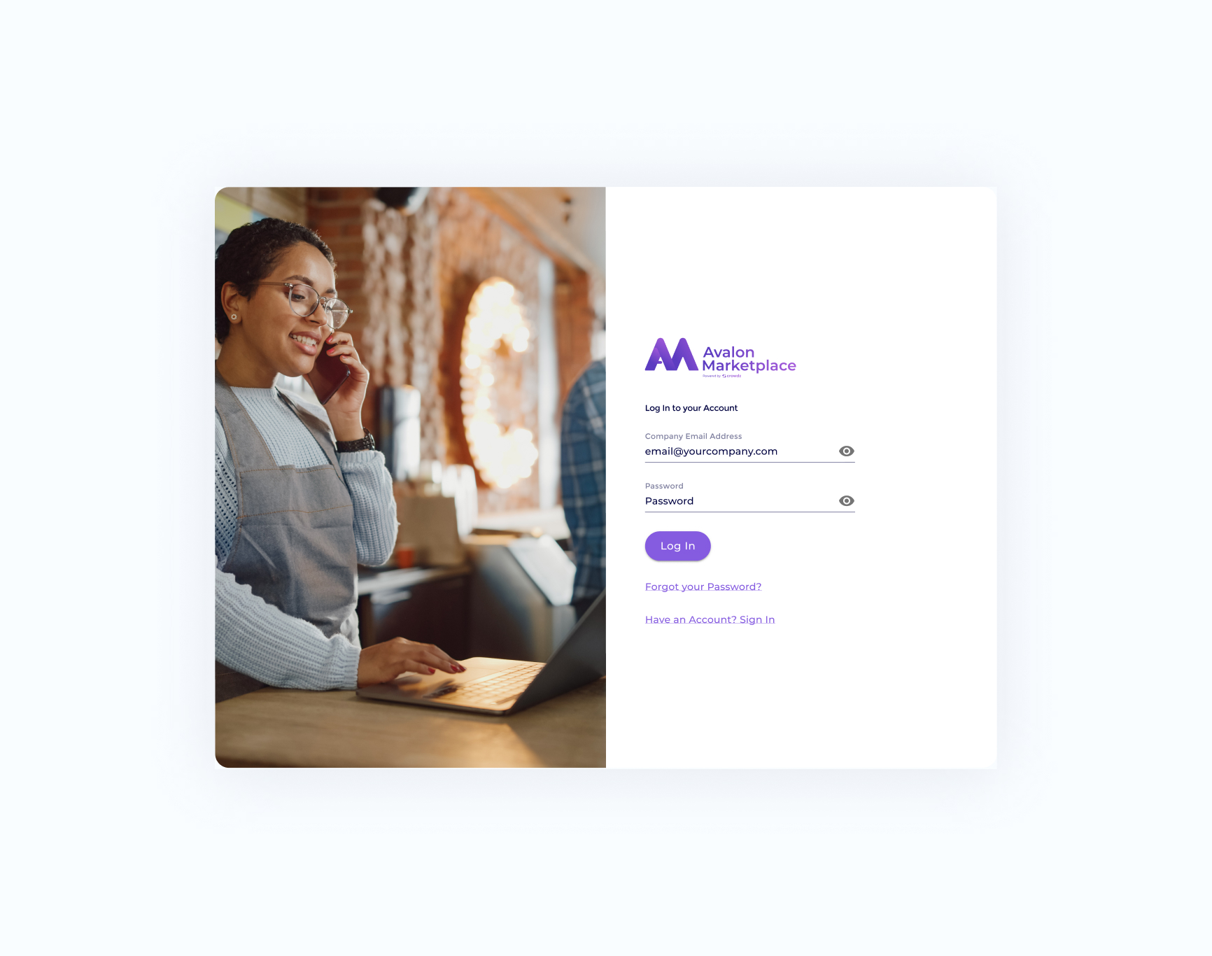
We kept the login page very simple. A rotating picture of small business owner was added as a way to strengthen the belonging for users. To keep in mind, our app is replicated for multiple white-labels, so it needs to be scalable.
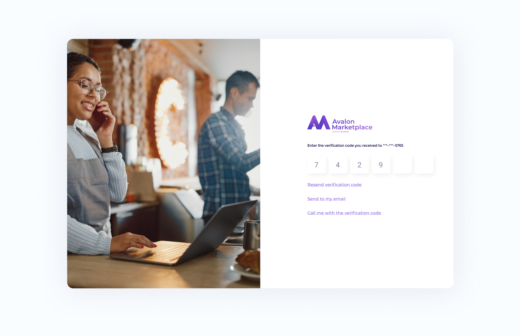
Here's an example of the OTP on desktop.
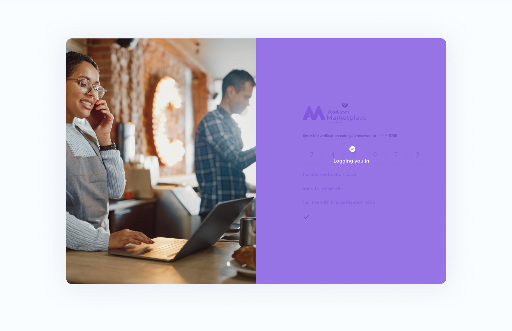
The design included many states to leave nothing to chance.
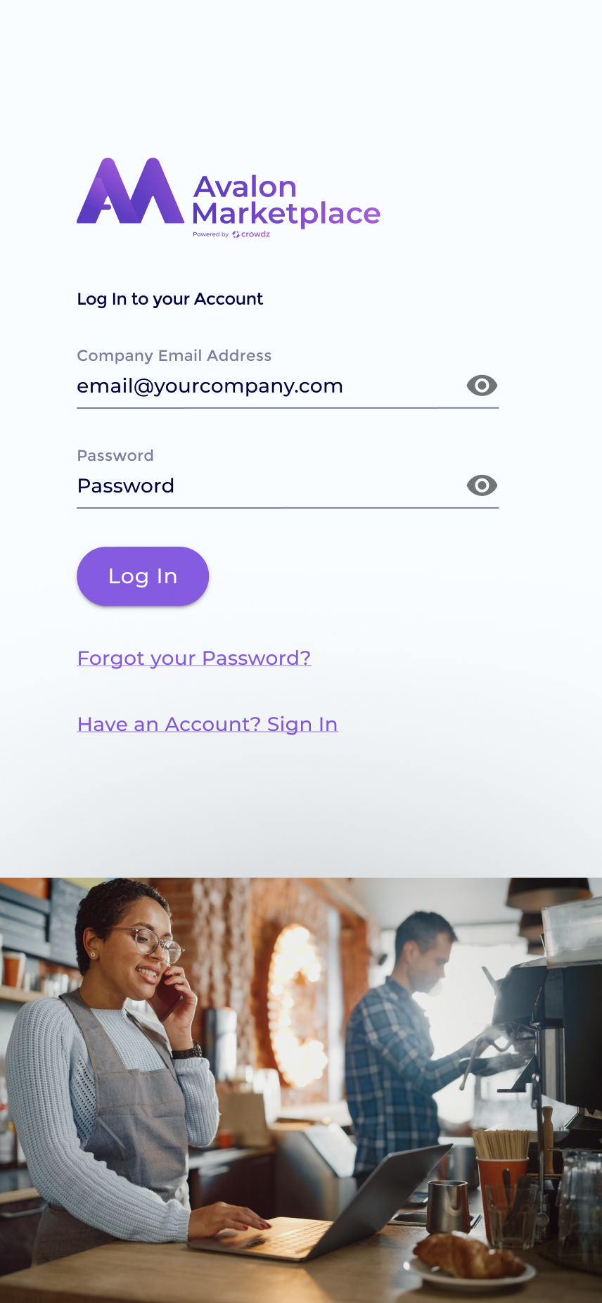
We also provided responsive screens to guide the development of the desktop app to the web mobile app.
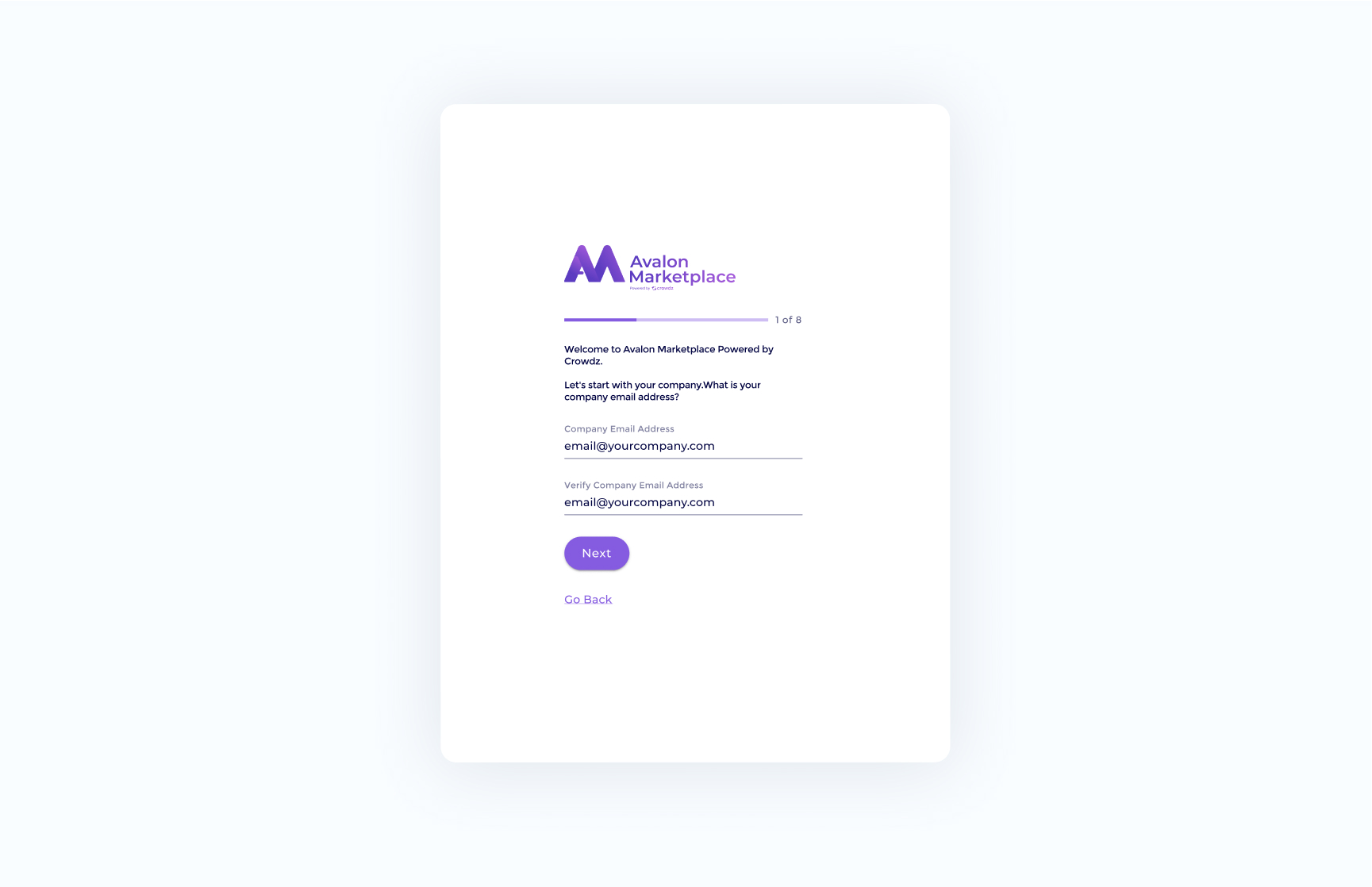
This screen is part of the registration. We kept a minimalist approach and added a timeline bar to let the user know where they were at.
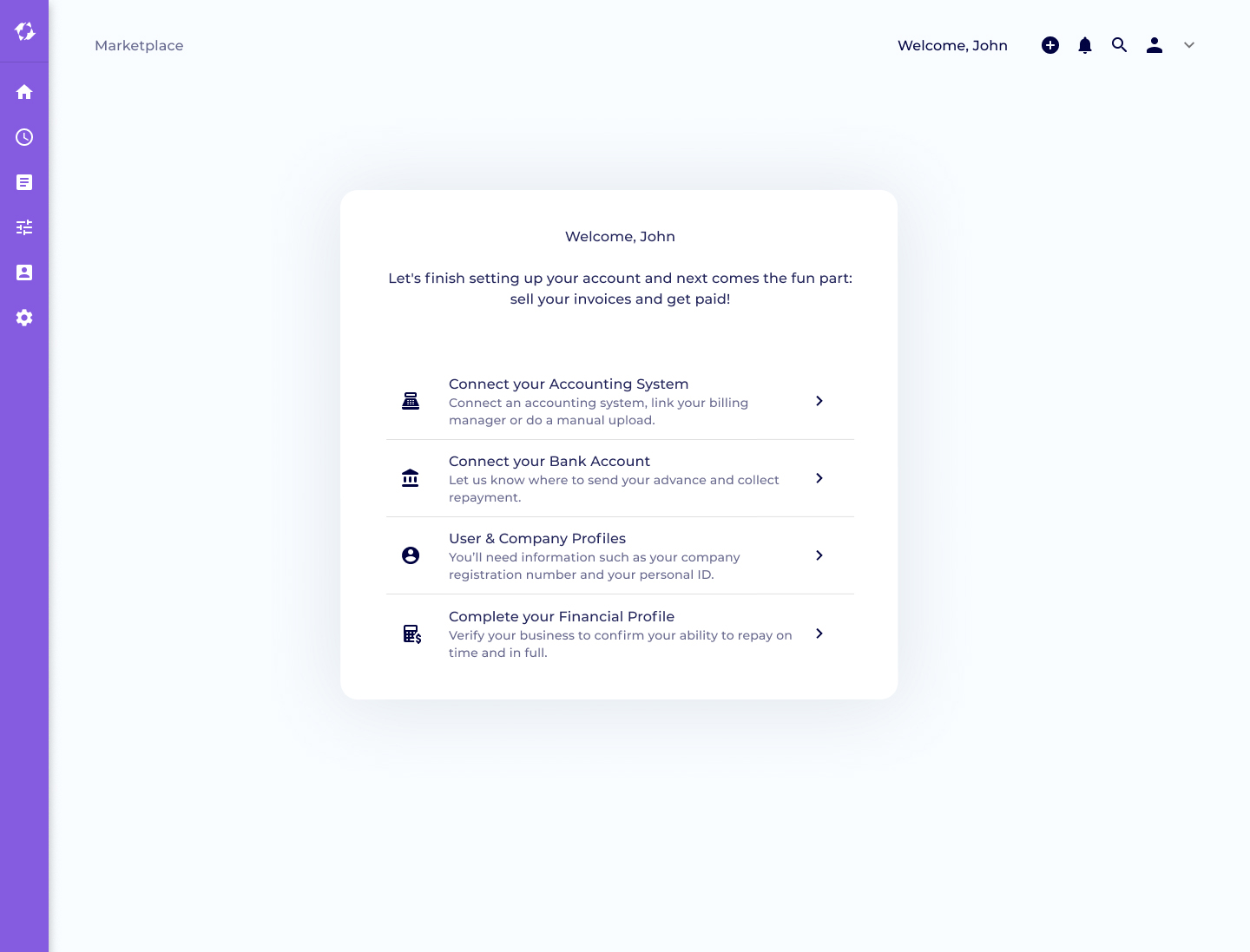
Due to the nature of the app, the users need to fill many financial information regarding themselves and their company. Our strategy was to have a guided post-registration with a step-by-step approach. As the users complete each step, they are guided throughout the app. This allows them to get familiar with the navigation while completing the post-registration.
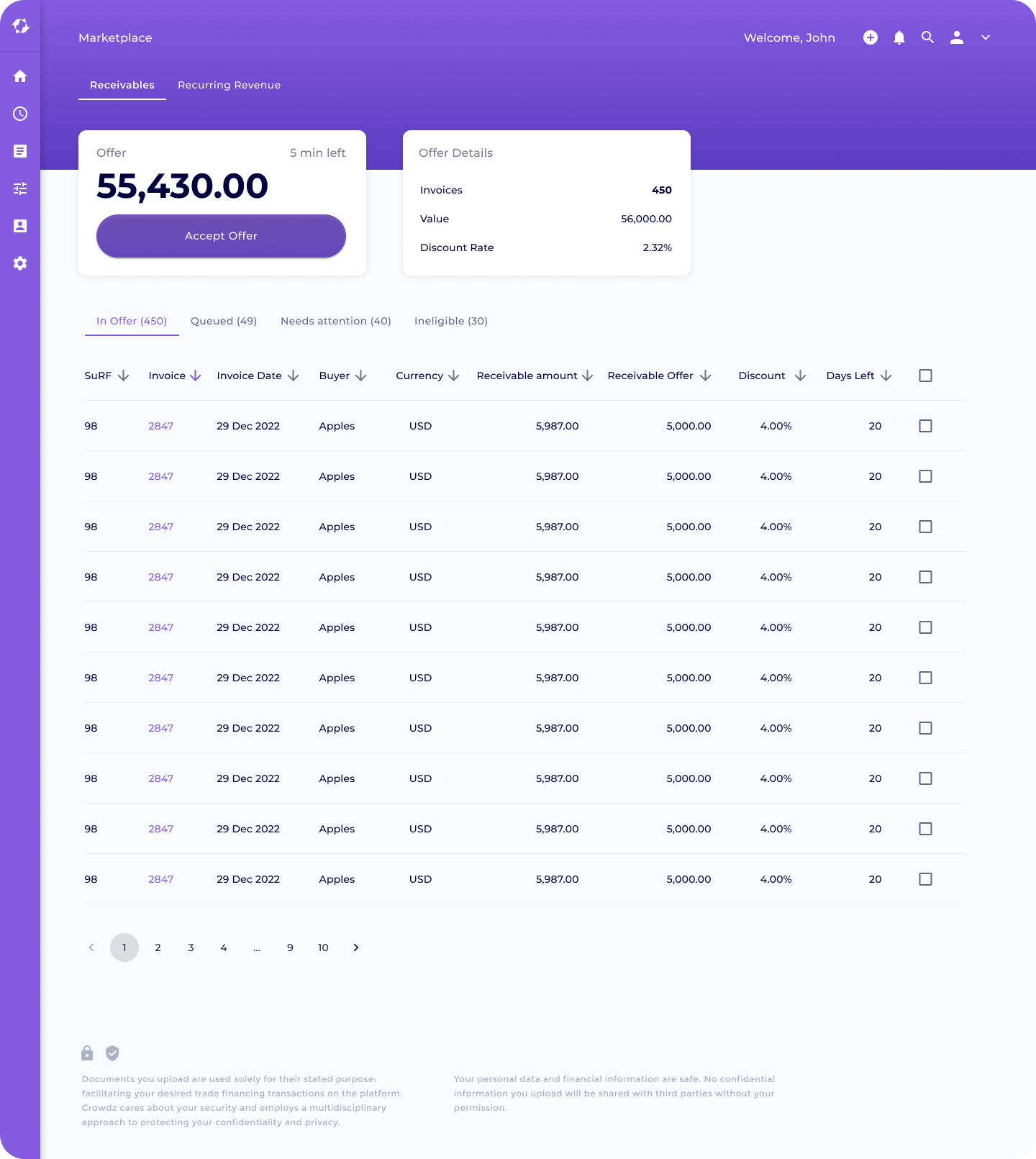
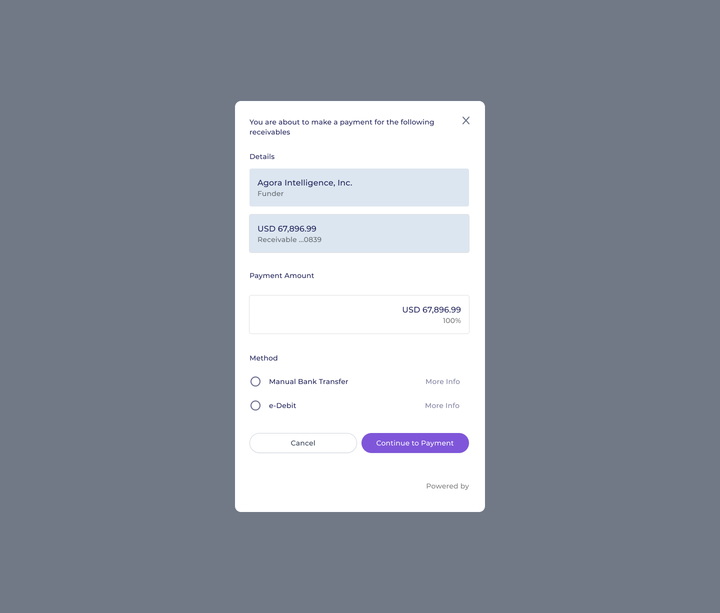
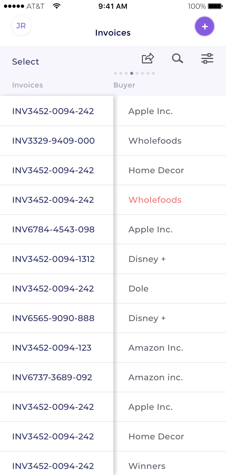
The main screen is the offer screen. This is where the seller manages their invoices and makes financial decision to accept or not the offer(s).
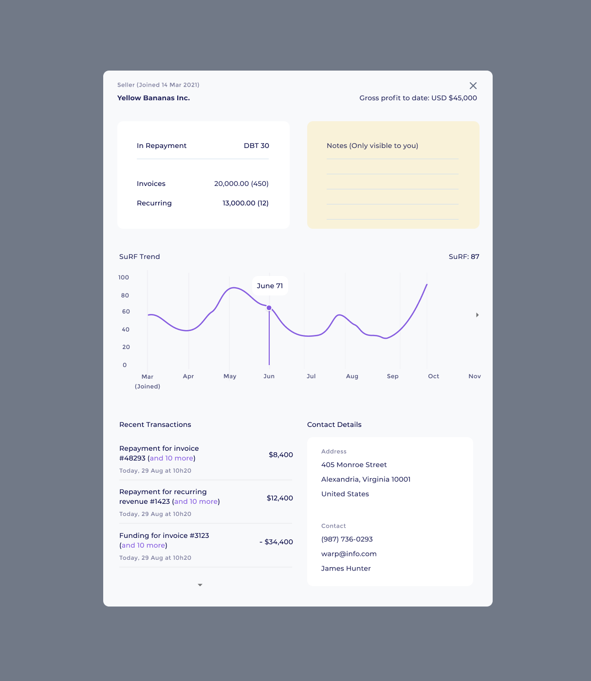
Complex modal example. To keep the tables uncluttered, some less viable information was added to modals available through a click. Here's a modal to describe a seller's profile to a funder.
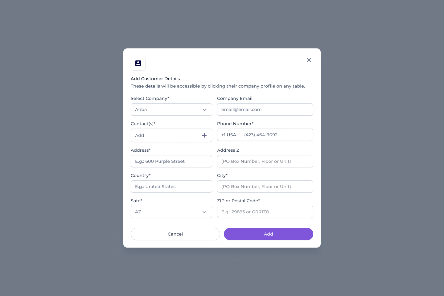
Example of a modal with a form.
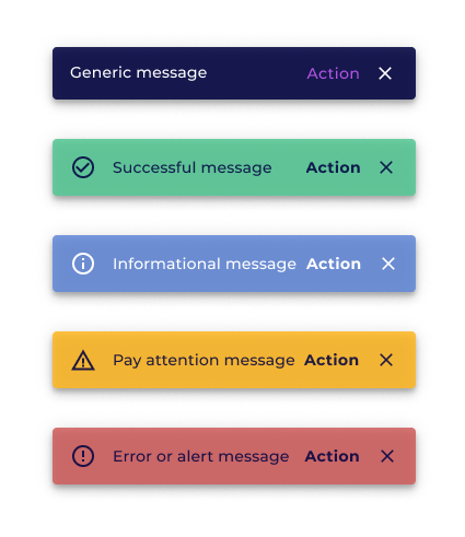
Part of the design system was snack bars. Snack bars are useful to give instant feedback to the user.
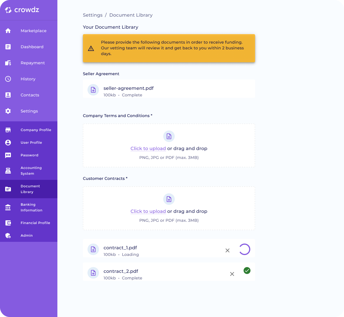
Here's an example of the left navigation bar. Prior to this iteration, the left navigation bar had drawers coming out to the right. Having these drawers opening down save us some real estate. To the right, an example of multiple states provided for development.
Here's how we managed to do the tables responsive. We kept the first column static while the other columns could be browsed through by swiping left and right.