To create excitement about the app, we built this kinetic prototype to have an eye-catching idea to propose. This prototype was done based on our web desktop app using Anima.
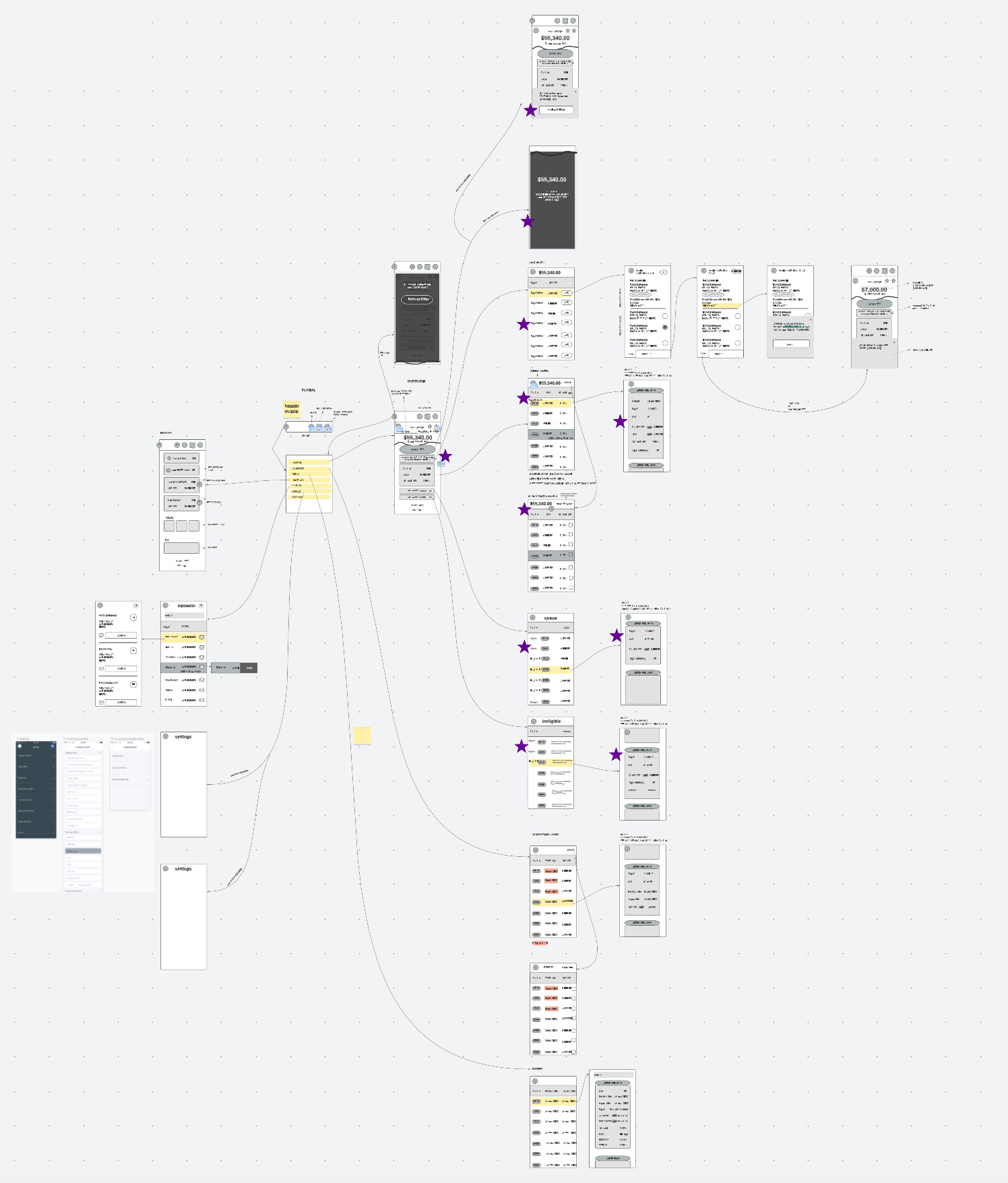
Back to the drawing board, we created a map using Lucidchart to allow for collaborative input with different stakeholders in the company. We then completed the flow with low res wireframes. LucidChart was useful to have interactive sessions where we would iterate live on our user flow. It was also essential to communicate our intentions to the rest of the team.
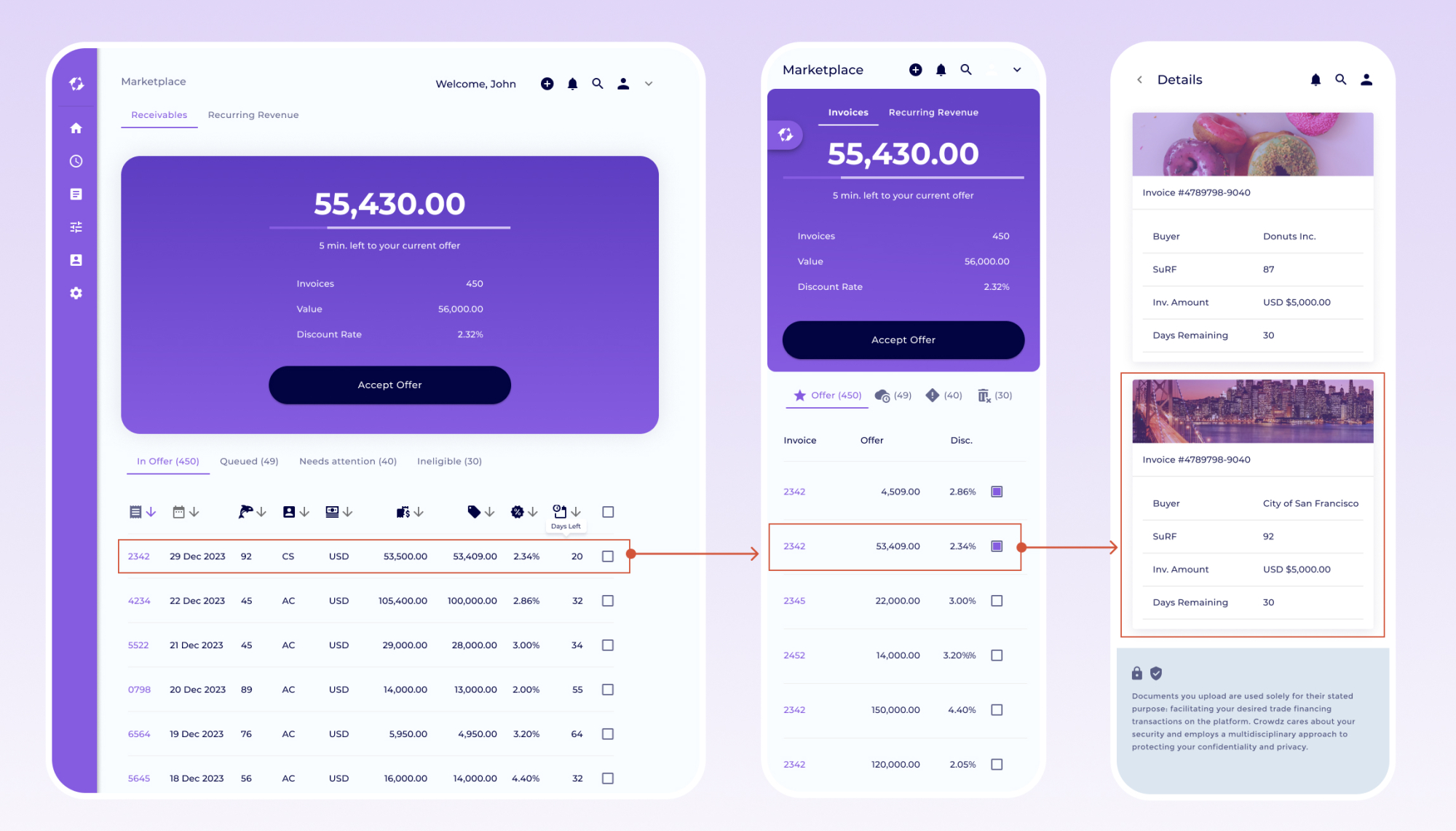
One challenge was the complex tables available on larger screens. After exploring multiple ways to make tables responsive, we've decided to keep our mobile tables to 3-4 columns only. Those columns would contain the necessary information for the user to make a decision. They could still dig deeper by tapping on the invoice number. That way, we kept the information available on mobile the same as the desktop. Here we see a larger screen table, a mobile screen equivalent, and the 2nd level of information available on tap. Good-to-have: A placeholder is available to show the physical invoice. If no images are available, AI generates an image based on the buyer's industry.
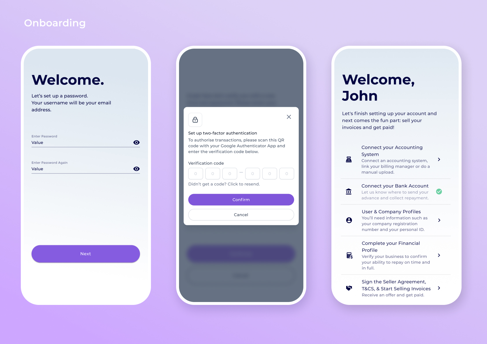
We split the onboarding into 2 sections: a pre-registration and a post-registration. The pre-registration contains simple questions and the OTP to create the account. Users are vetted after this pre-registration. This avoid frustration from a user who wouldn't meet the requirement to transact on the app. The post-registration contains steps needed by the user to start transacting on the platform. The split had many advantages, such as filtering MQL for marketing. Additionally, each step of the post-registration leads the user to a section of the app, making them acquainted to the interface while filing out necessary information.
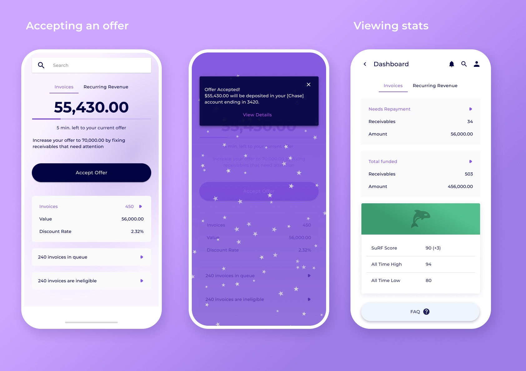
The offer screen is the main screen of the app. It is the most appealing to the user as they use the app to get cashflow for their business. In second is shown the acceptance state. We are using snack bars from the Material UI library to communicate events happening within the app. We added confettis to this one as this is the most exciting event that can happen. The third screen shows a dashboard with an overview of the user's data.
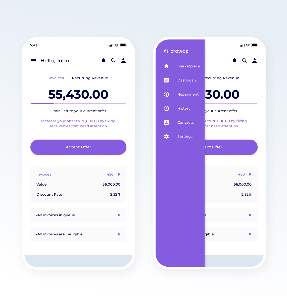
Showcased here is the left nav menu available on tap. As we kept the app simple with only 2 levels deep, the hamburger menu turns into a back arrow if navigating further. It's then possible to quickly go to that menu. This navigation also allowed us to keep the desktop pattern with which the user was familiar with.